Add Biome Coloured Water #3461
No reviewers
Labels
No Label
#P1 CRITICAL
#P2: HIGH
#P3: elevated
#P4 priority: medium
#P6: low
#Review
annoying
API
bug
code quality
combat
commands
compatibility
configurability
contribution inside
controls
core feature
creative mode
delayed for engine release
documentation
duplicate
enhancement
environment
feature request
gameplay
graphics
ground content conflict
GUI/HUD
help wanted
incomplete feature
invalid / won't fix
items
looking for contributor
mapgen
meta
mineclone2+
Minecraft >= 1.13
Minecraft >= 1.17
missing feature
mobile
mobs
mod support
model needed
multiplayer
Needs adoption
needs discussion
needs engine change
needs more information
needs research
nodes
non-mob entities
performance
player
possible close
redstone
release notes
schematics
Skyblock
sounds
Testing / Retest
tools
translation
unconfirmed
mcl5
mcla
Media missing
No Milestone
No project
No Assignees
5 Participants
Notifications
Due Date
No due date set.
Dependencies
No dependencies set.
Reference: VoxeLibre/VoxeLibre#3461
Loading…
Reference in New Issue
No description provided.
Delete Branch "biome_colored_water"
Deleting a branch is permanent. Although the deleted branch may continue to exist for a short time before it actually gets removed, it CANNOT be undone in most cases. Continue?
This pull request adds biome coloured water to the game.
The only problem is that flowing water always uses the default colour, no matter the biome. Until https://github.com/minetest/minetest/pull/12907 gets merged, it will sadly have to remain that way. But hey, this is much better than having just the same water colour everywhere anyways.
Since this was a way smaller update than the biome coloured foliage pull request and way less difficult to implement, this should likely be free of any issues, but feel free to suggest some code quality improvements and the like here and there.
@ -1026,7 +1026,8 @@ function mcl_util.get_palette_indexes_from_pos(pos)if reg_biome and reg_biome._mcl_grass_palette_index and reg_biome._mcl_foliage_palette_index thenAlso check for water palette index to guarantee a non nil return type.
The extra check has now been added.
While this is a great step forward towards nicer waters, I hope we can also do biome blending, because the lack of transition is quite brutal to the eye - it looks weird/unnatural. This is of course about terrain and water, so it's more than just Minetest PR 12907.
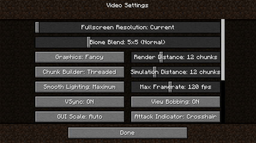
Minecraft has a 5x5 default setting, making the color transition smooth:
As nice as it looks, it comes with extra resource usage. So the two main questions are:
The 5x5 default blending option looks great in Minecraft:
Related issue: #2761
I think adding biome colour blending requires an engine change.
I could see this becoming possible in the future though via the help of shaders.
I reviewed the code and it's pretty good. The colours seem nice in isolation, but the transitions are a bit much. There is a mix between natural transparent colours and more gamey looking colours, and I do agree with Nicu transitions feel a bit harsh.
Is there any way to smooth it a little, or bring them together?
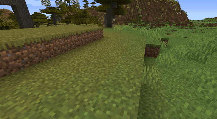
Attached pictures of some of the transitions.
That does indeed seem a little rough.
I would have tried smoothening this by increasing the
horizontal_blendof biomes, until I realised that biomes don't even have ahorizontal_blendoption, only avertical_blendoption.Apparently one of the previous core developers of Minetest considered it too difficult to add
horizontal_blend: https://forum.minetest.net/viewtopic.php?t=20914.The issue really lies with the fact that there is no colour blending setting, since Minecraft has the same effect as well with the oceans when colour blending is turned off.
I could open an issue at the Minetest GitHub for a colour blending feature though.
I personally don't find the rough ocean colour temperature transitions to bother me, though, and I doubt it will bother most players, since the majority will be playing inland, where this problem is almost nonexistent.
To me, it looks like oil spills or polluted/dirty water, which is quite annoying. If there difference in colors wouldn't be so sharp, it would be more bearable. This is personal preference, to be sure, but I wouldn't like to see this as it is currently. And I do play around waters because I like fishing and some of my homes are either on islands or on some mountain cave next to some shore, because I like having more biomes around.
Well, in that case, I guess I could add an
_alttexture for any people who are bothered by the sharp contrast in water colours. That way you can just put on a texture pack which softens the contrast between colours. Does that sound good to you?I opened a feature request for biome blend:
https://github.com/minetest/minetest/issues/13233
Feel free to give your best arguments there to add biome blend.
We should do our best effort for the game to look good by default, so that there's no need, for most people, to try new textures.
When people have to change textures, this implies that they:
Content->Texture packsexistsWhile I can't say that most people would feel like me about the contrast, I think that until we have a solution for biome blending, it would be nice to have this as an experimental feature that people can enable if they want.
Before even moving around, the first thing people get to experience with MineClone2 is its looks. That's why I'm quite cautious about visual stuff.
Well, you will never satisfy everyone 100% when it comes to graphics.
Graphics are one of the most subjective things in existence. I know some people who really aren't a fan of the PixelPerfection textures, and some people who would freak out if the PixelPerfection textures were gone the next day.
I really like the contrasting waters, and know for a fact that I would be impressed that biome coloured water is even a thing in this game.
The whole point of texture packs is that you can customise a game to look exactly how you want it to look like. One of your arguments that Minetest users don't know about texture packs is quite odd, since Minetest users tend to be even more tech savvy than Minecraft users are.
Adding an
_alttexture is the only way I know of to satisfy both you and I.Grass and foliage also have sharp and contrasting biome borders, so why the complaining about water all of a sudden?
That's quite a take on what I actually said. :P I get that you want your work in, and enabled by default, but considering we're only halfway to having a nice experience, I can't support this being enabled by default.
We also need to be aware that we will always have new people coming to Minetest+MineClone2, and they have to get used to the client and its many settings. And the closer we get to feature completion compared to Minecraft, the more attractive the game will be, and that means we'll get grow faster and more new people will join.
Yes, alternative visuals are important until we have a way to do proper biome blending. My vote goes for the non-jarring visuals by default.
My vote goes for the non-diluted visuals by default, with the diluted water being the alternate version.
The contrasting water is a literal non-issue, and you would need to look really hard to find any examples such as those screenshots. Not to mention that of course the contrast between biomes is way more visible when you are flying through the air in creative and you get a view of a much larger part of the world.
The issue is that cold and warm biomes border each other sometimes (such as extreme hills and mesas, even though those two biomes have vastly different temperatures). If that issue got resolved somehow, then so would this "issue" be as well.
I refuse to change any defaults right now. I'm sorry.
In the words of Paramat:
"but in a voxel world extreme smoothness looks out of place"
"they should not have bothered and just accepted abruptness and realised it is not a problem."
"Also of course, a voxel world is inherently abrupt, to chase extreme smoothness is a ridiculous thing to do, voxel games embrace and welcome abruptness, it's part of their character."
I am going to continue this discussion tomorrow (since I am tired both mentally and physically), but right now I hope people reconsider and change their mind about forcing me to change the default water colours.
I am tired of these aesthetic nitpicks over the most minuscule of things which a texture pack could easily remedy.
I am tired of this hypothetical player which complains about the smallest of details, and if not everything is 100% how said player wants something to be, this player leaves and never plays again.
For goodness sake, please give this a chance and step out of the comfort zone. The more variable water colours may very well grow on you. I try my best with these things. I really do.
That attitude doesn't help PRs the get merge in general, with any software (open/closed).
I looked in the forum post you mentioned, as well as the issue and PR he brought up there, and I couldn't find those quotes. Not that it matters if he actually said that anyway, considering he's entitled to his opinion just as anyone else.
But I have to point out that Minecraft is actively played by millions of players and they would have a different opinion that paramat's. You even brought up issue #2761 about biome blending, so it goes without saying that you see the importance of that.
If this is a most minuscule thing to you, why does it bother you to the point of being tired of people who don't see things your way?
These are not small details.
I appreciate your work on this because I want coloured water too, and this took us closer to that. But without blending, we're not in a good enough position to change the visual defaults for everyone.
I've just had enough of being pushed around for today. That's why I said that.
It's from this one: https://github.com/minetest/minetest/issues/2816
The point I was trying to make is that until smooth biome transitions get added, people should deal with the starkly contrasting biome water colours.
And as I have said previously, anyone who doesn't like it, could just easily change it via the alt texture I proposed.
It is exactly because it is a minuscule thing that I dislike nitpicks about it.
For me they are, especially since the only time you see water borders like this, is at the borders of a biome, and biomes are enormous in MineClone 2.
I could ask everyone tomorrow on SUAC which palette they want as the default. It might settle this argument, right?
I don't consider this an argument, it's just differing opinions that you don't seem to handle well. Also, it doesn't look great when you make such contrasting statements...
in the Minetest issue tracker:
versus here:
and later, also here:
When people have opinions different than yours it doesn't mean you're pushed around. You just want your PR merged, and "refuse to change any defaults". That's more pushing around than anything written here. I understand your passion for this PR and the change itself, but this is the wrong approach to push it forward.
The problem isn't that people have different opinions. The problem is that those different opinions are the only reason a pull request has not been merged.
Let's make a deal: You get the diluted colours as the default, but if I figure out any way to smoothen biome transitions, then the original water colours become the default again.
It makes perfect sense to carefully discuss the things that impact the default visuals or gameplay. And it only took a few hours, so we're doing really good on time.
That's pretty much what I suggested, I'm glad you agree. I'd love to have this in, but with blending. To be clear, we need to do this without a significant performance impact. Ideally the engine should handle it, but if you find a clever workaround that is kind on resources, awesome!
There, now I don't want to hear any more complaints about "oil spills".
Here is an example of biome dithering in mapgen v6.
Would something like this be a good solution until client side biome colour smoothening gets added (which would probably take forever)? Instead of large cubes being splattered everywhere, they instead get dithered down into a smoother mix.
I feel the changes are a big improvement, especially near the cliffs. It feels a more natural transition. When it's less harsh, it gives me chance to enjoy it :).
Everything Nicu raised, I had similar concerns about, and got feedback from others to see what they thought.
He raised genuine concerns that we had.
We go into every PR wanting to merge it, and absolutely do not enjoy having to say no. Belittling genuine concerns is not helpful in the slightest. We are working with you to try and get your PR in rather than flat out refusing.
The problem we get is if we agree to everything, then things descend rapidly. We have to ensure things are better than before the merge.
When giving feedback that we need changes, we reluctantly don't want to give this and getting attitude in return doesn't exactly fill you with joy when the next PR comes in, and if you want your PR reviewed promptly, it's worth considering.
I saw the comments in response, and just didn't want to get involved, and in that case, I would defer to Nicu's opinion.
I apologise for anything that I wrote before that sounded mean spirited.
I always tend to get overly defensive of these kind of things. It didn't help either that I tend to get grumpy in the evening, and that the complaints about the contrasting water colours took me by surprise.
But hey, now everything has settled a bit, and my mind is a bit clearer.
This one came early in the morning, not in the evening, so . If I were to reply based on your attitude, I would reject this.
I tried your updated version, and while it's considerably better, I'd like to hear other people's opinions about it:


These are easier on the eye, but they still look weird. Biome blending might not be sorely missed on land, because it's solid and pretty much anything goes. But water needs blending because it's supposed to mix, and currently it looks unnatural.
When I said the following, I meant that we need the existing defaults, and what you did here would be an alternative:
And when you mentioned the "diluted colours as the default" I assumed we were on the same page. We're sort of halfway there, but not in a great spot. Just like you twisted what I said about those unfamiliar with the settings, you pushed the dulled colors despite me saying something obviously different.
But they're better, so I'll wait for other opinions on the updated colors.
It may have been early in the morning, for someone to straight up insult my work in what I assume is a serious manner, I will never accept.
Who are these other people? We will never get to hear any opinions other than that of yours, @ancientmarinerdev, and some other collaborators on here if this pull request never gets merged.
We need a much bigger test group than this if we want to hear the playerbase's honest opinion on this.
Don't get me wrong. The opinions of the collaborators and developers matter as much as everybody else's, but said opinion is not necessarily representative of that of the entire playerbase's.
See the picture.
So the complaints about the contrasts were only because water is supposed to mix? Minecraft has never been a game of realistic physics, so to suddenly use this as an argument in a Minecraft clone is confusing.
I could understand disliking something because it looks bad in your opinion, but to say it looks bad only because it's unrealistic is weird to me.
Well, guess we both have a whole different view of what "diluted" means.
If you find them better, then that's both core devs agreeing now.
I understand that some don't want to take risks, but I am not one of those people when it comes to this game. I think that we won't get anywhere if we're always too careful with updates because someone might not like it.
We cannot rely on an engine feature which would probably take years to arrive.
Randomly complains about oil spills in MineClone2 for the hell of it.
A wee bit too defensive, it isn't insulting your work, just highlighting that some bits may need a bit of tweaking to do justice to your work. Originally, there was a natural transparent look that clashed with a gamey bluely look. While contrast is good, it should be thematic and within the art style.
Their opinions count when things are divided. Obviously you will approve of your work, and if there is doubts, we need multiple opinions to gauge whether it is a step forward. I would not fear feedback if you're confident of your work.
To reiterate, we aren't trying to block, we're trying to verify and ensure it meets standards. I am looking for reasons to merge this, not for reasons not to.
You have to realise that originally I pulled Nicu in for a second opinion. I was still in two minds, and I asked my g/f what she felt about the new mixed water colours, and in both cases I very specifically did it in a way that didn't bias the result. She kind of had the same feeling, so the first 3 people that saw this wasn't particularly happy. I trusted my own view on this, but I reached for others in case it was just a personal thing for myself, and it wasn't.
Your changes since have improved things significantly from the first pass. IMHO, that was unmergeable and made it look less good.
And that's where other opinions come in.
We have no problems with risks, but the whole point with risks is weighing the good against the bad. If the good parts don't outweigh the bad parts, the risk isn't worth the shake. At first it was like that. Second attempt did remove some of those negatives and really help the case.
I'm glad you are bold and want to take risks, that could be a real asset. Our differences of perspectives aren't bad things, it means that we get to something that most love, rather than a handful of risk takers. We have to ensure the game works for our player base. We have 250k downloads and don't intend to just stick a middle finger up at them and say their feelings don't matter.
Correct, so the right now has to be good. If we support the last 2 version and it doesn't make 5.7, we're at least 1 year away, and maybe more so from engine improvements so the right now is essential.
Well, now the contrast has been lowered a lot, and this issue has been resolved.
It didn't sound like feedback to me. It sounded more like harsh criticism to me, and very subjective.
I can't really do anything about the fact that the biome borders are sharp. Making the water less contrasted doesn't really do anything except hide the borders.
I didn't know that those rough borders bugged everyone so much apparently. I though it was just a case of "Eh, I don't really like it personally, but I'm going to let it slide. Other players might like this more.".
The meaning of "diluted" is not subjective.
That's the thing. I see way more upsides to this and downsides. There are a ton of upsides, and only one downside. A downside which a texture pack could have easily removed entirely.
Once again, we never will get to hear their feelings about this if they never get to experience this.
And the right now has been changed now with the less contrasted colours.
My opinion not so important, but you did ask. Here is a thought. If minetest's implementing biome blend will beautify these water transitions automatically, I think it's worth having this code merged in provided quality is good, and regardless of the consensus on the "dilution level" or visuals.
I feel it's more important for this change to be "biome-blend" ready, and less important to strike a perfect look with workarounds (such as diffusion).
This is assuming consensus can be reached on the visuals at all, but I don't care what it is really :)
I do like the different coloured water but I wished it was more a bit like what you kind of see inside of Minecraft where it fades into other colours same with the grass and leaves
Thank you for agreeing with me.
Thank you as well for agreeing with me. I opened an issue at minetest to add this blending.
No complaints is a good sign, so I think we're in good shape to merge this and have many others try it.
Thanks for the changes, @FossFanatic!
I will try adding the original palette back again when the time is right, but for now, this will have to do, I guess.